

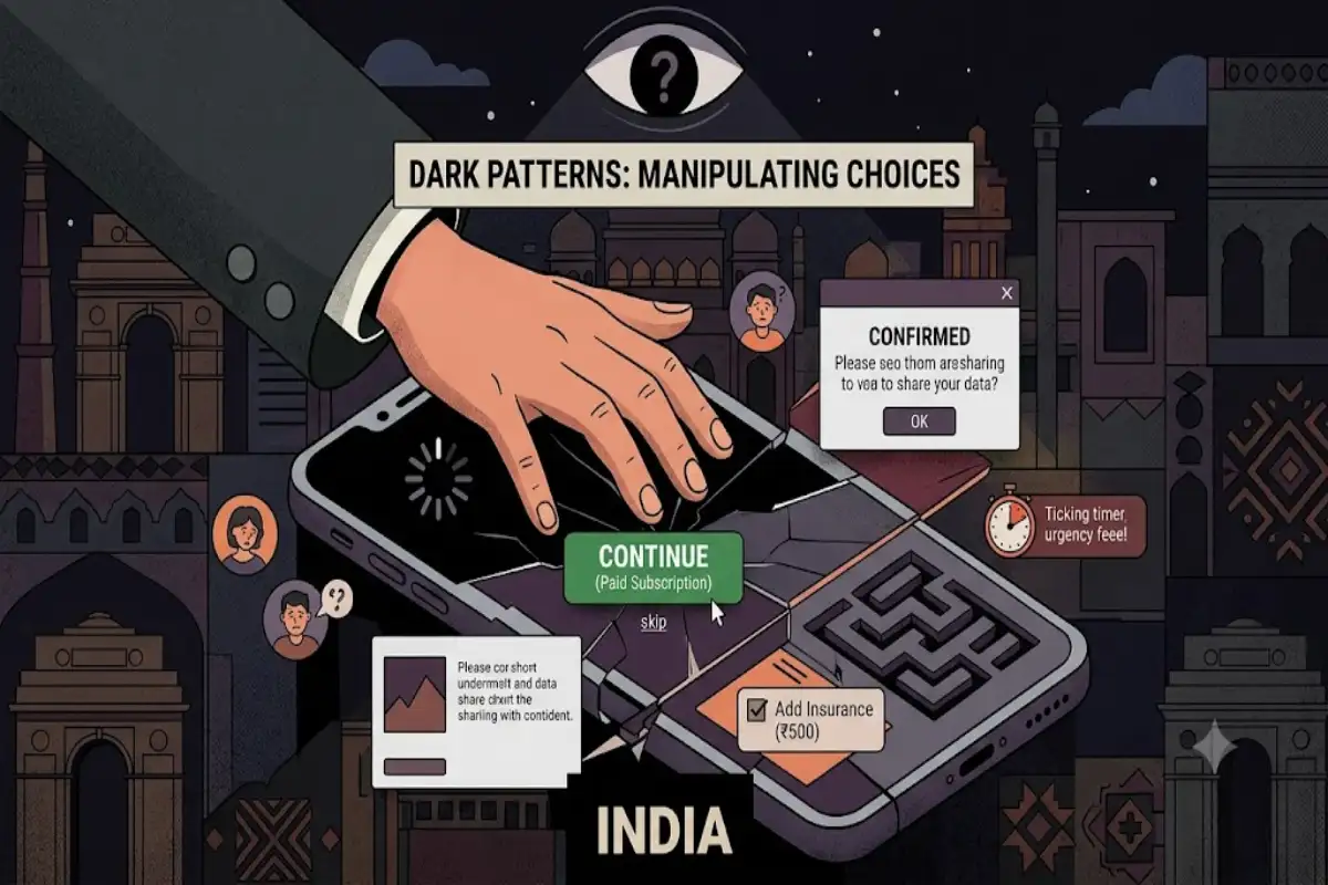
You have almost certainly been manipulated by an interface this week. Perhaps a countdown timer that reset when you reloaded. A travel fee that appeared only at the final screen. A pre-ticked insurance box. A cancel button hidden three menus deep while the upgrade button sat under your thumb.
These are dark patterns: design choices that work against the user’s interest while remaining technically honest. The term was coined by designer Harry Brignull around 2010, and the practice has grown from a niche complaint into a regulated consumer-protection issue in several countries, India included.
Learning to name them is most of the defence, because they rely on being felt rather than noticed.
What Separates a Dark Pattern From Persuasion
Marketing tries to make a product look appealing. That is legitimate. A dark pattern makes the *interface* work against you, exploiting the fact that people read screens quickly and trust defaults.
The practical test is simple: if the design were explained aloud, would a reasonable user object?
“We show a timer that isn’t real so you hurry.” “We added an item you didn’t choose.” “We made cancelling harder than subscribing.” Each one fails that test immediately, which is why none of them is ever stated plainly.
The Catalogue
Most dark patterns are variations on a handful of mechanisms.
False urgency. Countdown clocks, “only 2 left”, “3 people are viewing this”. Sometimes true, frequently generated. The giveaway is a timer that resets or a stock count that never moves.
Basket sneaking. Items added to a cart that the user never selected: insurance, donations, priority delivery, warranty cover.
Drip pricing. A headline price that grows through the checkout as fees, charges and taxes are revealed one screen at a time.
Subscription traps. Signing up takes two taps; cancelling requires a phone call, a retention offer and several confirmations. Sometimes called the roach motel: easy to enter, hard to leave.
Confirmshaming. The decline option written to make you feel foolish. “No thanks, I don’t want to save money.”
Forced action. Requiring an unrelated permission, account or newsletter signup to complete a task you have already paid for.
Interface interference. The preferred button large and coloured, the alternative rendered as faint grey text that barely looks clickable.
Trick questions. Double negatives and inverted checkboxes in consent flows, so that reading carelessly produces the answer the business wants.
Nagging. Repeated prompts for location, notifications or ratings, resurfacing until the user gives in.
Disguised advertising. Promoted content formatted to look like editorial or like search results.
India Now Regulates This
In November 2023, India’s Central Consumer Protection Authority issued guidelines specifically on dark patterns, naming a list of prohibited practices that maps closely onto the catalogue above, including false urgency, basket sneaking, confirm shaming, forced action, subscription traps, interface interference, bait and switch, drip pricing, disguised advertisement, nagging and trick questions.
That matters for two reasons. It gives consumers a vocabulary that regulators already recognise, which makes complaints easier to frame. And it puts product teams on notice that these choices are no longer merely distasteful.
Enforcement of any consumer regulation takes time, and how it applies to a specific case is a question for a lawyer. But the direction is clear enough that “everyone does it” has stopped being a defence.
Where You Will Meet Them Most
Travel and ticketing are the classic home of drip pricing and false scarcity, because urgency is plausible: seats genuinely do sell.
Ecommerce specialises in basket sneaking and interface interference at checkout.
Streaming and apps rely on subscription traps and free trials that convert silently.
Financial and gaming products produce the subtlest version, because the dark pattern lives in the terms rather than the buttons.
That last category is worth examining closely, because it shows how a pattern can hide in plain text.
Case Study: Bonus Terms
Any offer phrased as free money is a useful place to learn pattern-spotting, whether it is a cashback promotion, a sign-up credit or a welcome bonus.
The headline is simple and the conditions are not. A bonus may require the amount to be wagered several times before anything can be withdrawn, only on selected products, only above certain odds or prices, and only within a short window. Each condition is disclosed somewhere. Together they can make the offer impossible to realise, which is the point.
The honest version of the same offer states the multiple, the qualifying conditions and the expiry in the same place as the headline, in language a tired person can parse. Explainers like the one on the CricketOnlineID site set out how wagering requirements work and why a large bonus with a high multiple is often worth less than a small one with none, which is exactly the comparison the fine print is designed to prevent you making.
The transferable lesson: when an offer’s value depends on conditions, the design question is whether those conditions appear next to the number or three screens away from it.
The Pattern Most People Never Notice: Defaults
The quietest dark pattern is not a button or a timer. It is the setting you were never shown.
Most people accept defaults, in every product, in every country. That is not laziness; it is a reasonable response to the fact that nobody can audit every toggle in every app they use. Designers know this, which is why the position of a default is a commercial decision rather than a neutral one.
Defaults worth checking on any app that matters to you: notification permissions, location access, contact list access, personalised advertising, data sharing with “partners”, and auto-renewal on anything you pay for. In most apps these sit in different menus, which is itself a choice.
The honest version of this is a setup screen that states the default, explains what it does in one sentence, and makes the alternative equally easy to pick. You will know it when you see it, mostly because it is rare.
Why Teams Ship Them Anyway
It is tempting to assume dark patterns come from cynical designers. Usually they come from well-meaning teams measuring one number.
A team asked to raise checkout conversion will test a pre-ticked box, see conversion rise, and ship it. The experiment was honest; the metric simply had no way of registering the customer who felt tricked, because that cost appears later, in refunds, in support tickets and in whether the person returns.
Short test windows make this worse. Almost every dark pattern wins a two-week A/B test and loses over a year, and very few teams run year-long tests.
The structural fix is to pair any conversion metric with a counter-metric: refund rate, cancellation rate within 30 days, support contacts per thousand orders, or repeat purchase rate. A change that lifts conversion and lifts refunds is not a win, and only a paired metric will show it.
How to Spot Them in Thirty Seconds
A quick checklist before committing to anything online:
- Reload the page. If the timer resets or the stock count changes, the urgency is manufactured.
- Read the total, not the headline. Compare the first price shown with the final payable amount.
- Check the cart line by line before paying.
- Find the cancel path before you subscribe. If you cannot locate it in under a minute, assume it is deliberately hidden.
- Read the greyed-out option. The option designed to be invisible is usually the one that serves you.
- Re-read any checkbox with a negative in it. Say it aloud if necessary.
- Look for the conditions next to the offer. If the headline is on screen one and the terms are on screen four, the gap is the product.
If You Have Been Caught
Practical steps, in order:
- Screenshot everything: the offer, the checkout, the terms as displayed. Interfaces change, and your evidence disappears with them.
- Complain to the business in writing, stating what was shown, what you were charged and what you want.
- Use the National Consumer Helpline on 1915 or the consumer grievance portal if the business does not resolve it.
- Dispute the payment through your bank or card issuer where a charge was unauthorised or the service was not provided.
- Report the pattern itself, not just your loss. Regulators act on volume, and most people never report at all.
For People Who Build Interfaces
The uncomfortable truth is that dark patterns usually work in the short term. Conversion goes up, which is why they spread.
What they cost shows up later and in different dashboards: refunds, chargebacks, support load, poor reviews, and the slow erosion of the trust that makes repeat purchases cheap.
A reasonable internal standard is the one from earlier: would you be comfortable explaining this design choice to the user, out loud, in plain language? Teams that apply that test tend to find their checkout gets shorter, their cancellation flow gets honest, and their support queue gets quieter.
Attention Is the Thing Being Taken
Dark patterns are not primarily about money. They are about exploiting the gap between how carefully a designer can plan a screen and how carefully a distracted person can read one.
That asymmetry is permanent, which is why the defence has to be habitual rather than vigilant. Slow down at the three moments that matter: when a timer appears, when a total changes, and when a checkbox is already ticked.
Dark Patterns in Indian Apps: How to Spot Them, and What to Do